One, color
二、版式
Two, layout
三、明确表达主题
Three. Express the topic clearly
今天随手写写关于平面设计的几个定律,我自己的定律,不知对不对。
Today, with my hand written on several laws of plane design, my own law is not right.
一、注意字体。
First, pay attention to the font.
无论是标志还是排版。作为标志,有时图形是次要的,字体可以帮你解决很多问题,努力学习,掌握字体的设计。
Whether it's a sign or a typesetting. As a sign, sometimes graphics are secondary. Fonts can help you solve many problems, learn hard and master the design of fonts.
二、还是字体。
Two, or a font.
一切都离不开版式,一切版式都离不开字体。作为东方文化杰出的代表——中文字体,你得好好琢磨。
Everything is inseparable from the layout, all formats are inseparable from the font. As the most outstanding representative of Oriental culture, you need to think carefully about Chinese characters.
一开始,你好先想到是宋体还是黑体,特殊的情况下,你才去考虑是否选用这两大字体之外的字体。简单的讲,宋体很严谨,很庄重,也很尊贵;黑体,很现代,很整齐,很简约。
At the very beginning, you'd better think of it as a song or a blackbody. Under special circumstances, you should consider whether you choose the font other than the two big font. To put it simply, the song style is very strict, solemn, and honourable; it is very modern, neatly and very simple.
其次,字体的间距好小于常规间距。以“0”为标准,你好取“-50”,这可适用于标题类字体排版,作为大面积的正文排版,同样需要稍微缩小字体的间距,稀疏的间距不但不能完成轻松阅读的任务,反而会让眼睛疲惫。把握“紧凑”和“稀疏”的区别。
Secondly, the spacing between typefaces is better than conventional spacing. With "0" as the standard, you better take "-50", which can be applied to the title type typesetting. As a large area of text typesetting, it also needs to narrow the spacing of the font a little. The sparse spacing can not complete the task of easy reading, instead, it will make the eyes tired. Grasp the difference between "compactness" and "sparsity".
后,字体的高度,好压一压,就是压扁一些,这样,汉字看上去,会更象汉字一些。
Finally, the height of the font, preferably pressed, is squashed, so that Chinese characters will look more like Chinese characters.
说的对不对,不妨试一试,都是很简单的处理。
That's right. Let's try it. It's all very simple.
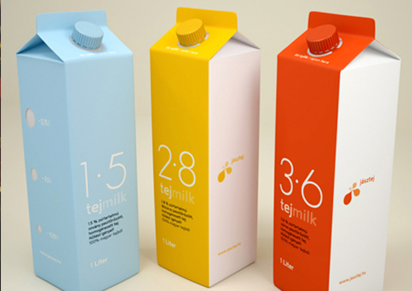
三、版式。
Three, format.
如果你功力不够,或者时间不够,好采用稳妥的排版方式。记得,在商业设计中,不要轻易尝试夸张的跳跃性的版式,那些看上去愈随意愈凌乱的优秀作品,需要的时间愈多,你需要非常扎实的构成功底,同时你需要处理所有已经出现的细节,并且要创造更多的细节。一个平面里,两个元素的距离可以扩展到无限大,但你得有足够的力气,不让它们跑出界了。越乱,越难,而不是反之。
If you don't have enough skills or time, you'd better use a safe typesetting. Remember, in business design, do not easily try to exaggerate the leaping format, the more random and the more random, the more time you need, you need a very solid foundation, and you need to deal with all the details that have already appeared, and create more details. In a plane, the distance between the two elements can be extended to infinity, but you must have enough strength to prevent them from going out of bounds. The more difficult it is, the harder it is, not the opposite.
四、回到“稳重”的版式上来,重要的一点是:节奏。
Four, back to the "steady" format, the most important point is: rhythm.
什么叫节奏?因为不同,所有产生了节奏。对比,反差,无论是面积也好,色彩也好,结构也好,不要什么都一样,也不要什么都不一样,否则,就没有节奏可言。可以用音符如何产生旋律来理解排版中的“节奏”。
What is rhythm? Because different, all have rhythm. Contrast, contrast, whether it is an area or color, or the structure is good, do not all the same, and do not have the same, otherwise, there is no rhythm. You can understand the rhythm in typesetting with how the note produces melody.
五、色彩。
Five, color.
如果你想提高,就尽量抛弃正统的红黄蓝绿吧。色彩的感觉,基本上靠天赋。但也可以培养,如果你爱看电影,多留意大师们的电影,看看里面的用色,就拿常见的来说,看看王家卫的电影,每一部,就是一本色彩学。平面设计中,色彩是什么?色彩不是红黄蓝绿,色彩是情绪,每一种色彩的选用和调制,就是每一种心情的表达。所以,重要的一点,你必须是个非常感性的人。
If you want to improve, try to discard the orthodox red, yellow, blue and green bar. The feeling of color is basically gifted. But you can also cultivate, if you love watching movies, pay more attention to the masters' movies, look at the color in it, and take a look at Wong Kar Wai's movies, each of which is a color science. In the plane design, the color is what? The color is not red, yellow, blue and green, the color is the mood, each kind of color choice and the modulation, is each kind of mood expression. So, the most important thing is that you must be a very emotional person.
上一篇:设计中的配色的种类有哪些?
下一篇:济南vi设计有哪些要点