It is impossible to enlarge with the ink manuscript in the large application design occasions such as buildings, signboards, etc. in order not to cause the deformation of the sign, causing misunderstanding and affecting the image of the public, it is necessary for us to draw up the standard drawing.
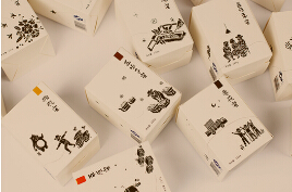
标准制图法种类很多,大多采用方格制图法。方格的密度以标志图形的繁简程度而定,图形越简单,密度越稀,总之,以方便制作为准。
There are many types of standard cartography, most of which are grid drawing. The grid density to mark the complexity of graphics and graphics, more simple, more dilute density, in short, to facilitate the production of prevail.
标准字是企业识别中基本要素之一,往往与商标同时使用,出现频率很高,运用广泛,几乎出现于所有的应用设计中。标准字的设计处理不但是信息传达的手段,也是构成视觉表现感染力的一种不可缺少和要素。由于标准字本身具有说明,又具备标志的识别性。因此,合二为一的字体标志越来越受到重视。
Standard word is one of the basic elements of enterprise identification, often used with trademark, frequency is very high, widely used, almost appear in all the application design. The design of standard words is not only the means of information transmission, but also an indispensable and essential factor of visual expression. Because the standard word itself has the explanation, and also has the sign recognition. Therefore, more and more attention has been paid to the combination of font marks.
标准字体包括吕牌标准字和企业名称标准字。它们的基本功能都是传达企业的精神,表达经营理念。就是说标准字是根据企业名称‘商品平派牌而精心设计的字体,对于每一个字的间距、笔画的粗细、长宽的比例、造形要素等都是经过严密推敲和严谨制作的。
Standard fonts include Lu brand standard words and enterprise name standard words. Their basic function is to convey the spirit of the enterprise, to express business philosophy. That is to say, the standard word is carefully designed according to the enterprise name "commodity flat" brand, for each word spacing, stroke thickness, length and width of the proportion, shape elements are carefully reviewed and rigorous production.
文字是一种视觉语言,同时又是一种可供转换的听觉语言。人们要在瞬间读出企业名称、品牌名称。这就要求标准字体做到大限度的准确、明朗、可读性强,不会产生任何歧义,更不会"猜字"。这是标准字的基本要求,由于人们生活节奏加快,他们不愿意把时间延误在仔细阅读和分辨文字上。
Text is a visual language, and it is also an audible language that can be converted. People want to read the name of the enterprise and brand name in a moment. This requires a standard font to achieve the maximum accuracy, clear and readable, without any ambiguity, but not "word". This is the basic requirement of standard words. Because of the quickening pace of life, they are unwilling to delay their time in careful reading and distinguishing words.
当今社会是以"激烈化"、"多样化"、"专精化"等三轴为中心而不断地发展变化。由于科学技术的不断发展,商品的品质、生产技术、销售价格均趋向"同质化",的差别就在形象好坏。企业为了扩大"市场占有率",提高士气,促进员工的向心力,利用信息传递活动来维持外界对企业的好感,而赖于运用CI来塑造企业形象,以增进差异化的竞争能量。
Today's society is constantly changing with the three axes of "intensification", "diversification" and "elaboration". Due to the continuous development of science and technology, the quality of goods, production technology, sales prices tend to "homogenization", the only difference is in the image of good or bad. In order to expand the market share, enhance morale, promote the centripetal force of employees, and use information transfer activities to maintain the goodwill of the outside world, enterprises should rely on CI to shape the corporate image, so as to enhance the differentiated competitive energy.
本文由济南vi设计提供技术支持,更多的详细精彩内容请点击我们的官方网站http://www.facons.cn,我们将会全心全意为您提供满意的服务。
This article provides technical support from Ji'nan VI design, more detailed and wonderful content, please click on our official website http://www.facons.cn, we will wholeheartedly provide you with satisfactory service.
上一篇:标志设计“姿势”你懂得吗?
下一篇:企业VI和景区VI在设计上有哪些不同?